Paper stationery should have become less interesting by now. Most people carry a notes app, a calendar, a camera, a scanner, and a task manager in the same device. A phone can remember almost anything. A laptop can organize far more than a notebook ever could.
And yet stationery keeps finding its way back onto desks, into bags, and across cafe tables. Not because it is more efficient than digital tools, but because it gives people a different kind of control. A good pen slows the hand down just enough. A planner makes a week feel visible. A sticky note turns one loose thought into something that can sit in front of you until it is handled.
That is the more interesting story behind the 2026 Japanese Stationery Awards. The winners are not only a list of clever objects. They show how much design work now happens around small, repeated actions: writing a line, sorting papers, marking a page, opening a parcel, carrying a few loose items without letting them disappear into the bottom of a bag.
This year’s strongest products are not trying to make stationery look futuristic. If anything, many of them move in the opposite direction. They focus on balance, visibility, ease, and the quiet satisfaction of using something that does one small job well.
The awards reward products that survive real use
The Japanese Stationery Awards, often referred to as the Japanese Stationery Store Awards, have a practical character that makes them different from many design conversations. Stationery can look charming in a product photo, but that does not tell you much. A pen has to feel right after several pages. A file has to be useful when it is full. A pouch has to work when it is clipped to a bag and bumped around all day.
That everyday test is part of why the awards matter to stationery fans. They tend to surface products that are not just attractive, but usable in ordinary routines. The winning items often answer very plain questions: Can I find things faster? Can I write longer without thinking about the tool? Can I carry this without it becoming annoying? Will I still want to use it after the novelty fades?
For readers who want the full category-by-category breakdown, Paper Whisper’s Full Review of Japanese Stationery Awards 2026 gives a wider look at the year’s winners and rankings. It is useful not only as a list, but as a way to see which kinds of everyday problems stationery makers are paying attention to this year.
A mechanical pencil won by doing less, not more
The Grand Prize went to LACONIC’s Solid Write mechanical pencil, and that choice says a lot about the mood of the year. LACONIC is more commonly associated with planners and diaries than with writing instruments, so its win with a mechanical pencil feels slightly unexpected. But the pencil itself makes the decision easier to understand.
Solid Write is not built around a showy mechanism. It does not ask the user to admire a complicated feature before writing. Its appeal is more physical than verbal: a metal body, a low center of gravity, a steady weight in the hand, a matte black finish, and a small hexagonal ring that keeps it from rolling across the desk.
That may sound modest, but modesty is the point. Mechanical pencils have become a category where brands often compete through engineering details. Some users enjoy that, of course. But a writing tool used every day has a different burden. It has to disappear into the hand.
Solid Write seems to understand this. Its design is not about turning the pencil into a gadget. It is about reducing the number of little frictions between the user and the page. In a year full of inventive stationery, the top award going to such a restrained object feels like a reminder that simplicity still has force when it is handled carefully.
The best storage tools do not just hold things
Sakura’s Komagoma Small Items Organizer File, the Design Award winner, is a quieter product. It does not have the immediate appeal of a new pen or a playful desk accessory. It is an organizer file, which sounds almost too ordinary to be exciting.
But anyone who works with paper knows the problem it solves. Storage is easy until you need to retrieve something. Receipts, labels, stickers, tickets, reference sheets, project notes, and journaling scraps can all be “organized” in a folder while still being difficult to use. A pile can become a folder, but it can remain a pile in spirit.
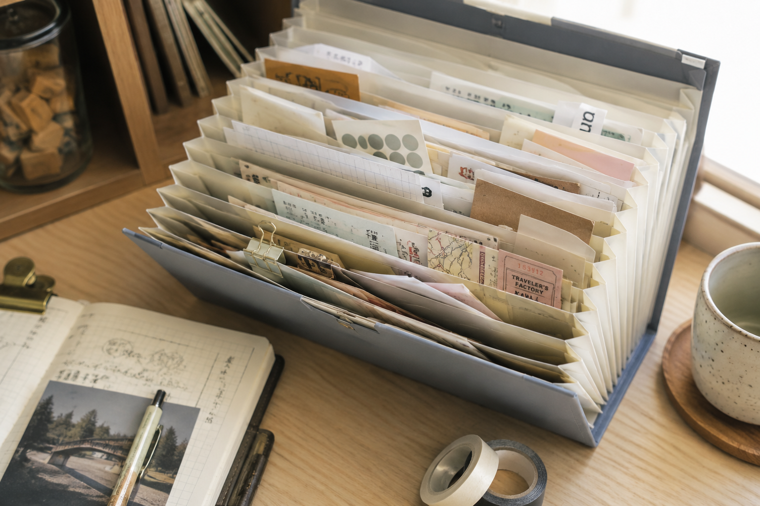 Komagoma improves the moment after storage. Its accordion structure opens wide and stands on its own, so the contents are visible instead of buried. That changes the relationship with the material inside. A journaling user can see stickers and paper pieces at once. An office worker can separate documents without flipping through a stack. A crafter can keep small paper goods accessible rather than tucked away and forgotten.
This is a small shift, but it is the kind of shift that makes a product stay useful. Good organization is rarely about maximum capacity. More often, it is about whether a system is easy enough to return to. If people can see what they have, reach it quickly, and put it back without effort, the organizer has done more than store objects. It has protected the habit.
Function matters most when it does not interrupt the user
Pilot’s FriXion Synergy 3, winner of the Functionality Award, brings together several familiar ideas: erasable ink, three common colors, and a fine writing tip. None of those elements is new on its own. The product works because it makes the combination feel obvious.
A student can use black for notes, red for corrections, and blue for emphasis. Someone planning a week can separate appointments, tasks, and reminders without carrying three pens. An office worker can mark up a document and erase a change that no longer applies. The value is not that the pen does something surprising. It is that it keeps a few ordinary actions close together.
That is harder to do than it sounds. Multi-function products often become clumsy because they want the user to notice every feature. The better ones do the opposite. They let the function sit in the background until it is needed.
FriXion Synergy 3 belongs in that second category. It is not trying to turn a pen into a system. It simply removes a few small interruptions from writing, correcting, and planning. For a tool that lives in a pencil case, on a desk, or beside a planner, that is enough.
Playfulness works when it earns a place in daily life
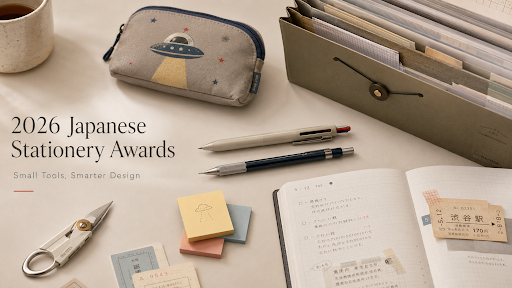
The Idea Award went to Sun-Star’s UFO Flat Pouch, a small zip pouch with a retro UFO theme. It can be clipped to a bag and used for everyday items such as earbuds, cards, keys, or small stationery pieces. It is fun, but it is not only fun.
This distinction matters. Japanese stationery is often described as cute, and that is not wrong. But “cute” can make the design sound less serious than it is. A playful object still has to earn its place. If it gets in the way, feels fragile, or serves no real purpose, the charm wears off quickly.
The UFO pouch works because the joke and the use case do not fight each other. A small pouch is already the kind of object people carry to stop tiny things from getting lost. The UFO shape and bright color palette give it a stronger identity, which may make the user more likely to notice it, carry it, and keep it in rotation.
In that sense, playfulness becomes part of the function. It makes a small tool more memorable. It gives a routine object a bit of personality without asking the user to sacrifice usefulness. That balance is one reason Japanese stationery continues to travel well beyond Japan: it treats delight as something that can live inside practical design, not outside it.
The category winners show how specific stationery has become
The category winners add texture to the same story. They show a market that is not only making better pens or prettier notebooks, but designing for increasingly specific moments.
In writing tools, products such as the Pilot Juice+ Gel Pen, KAYOU+ AIMVISION Pro mechanical pencil, and Sailor Profit Casual L Gold Trim fountain pen all serve different users. One is suited to everyday writing and light sketching. Another focuses on control and stability. The fountain pen brings a classic writing experience into a more approachable everyday context. The shared question is no longer whether the tool writes. It is what kind of writing experience it encourages.
Paper and journaling tools point in another direction. Kokuyo’s Campus Roll Sticky Notes make the size of a note more flexible, while Midori’s Yuru Log Color Stamp Set turns small marks and illustrations into part of the planning process. These are not dramatic inventions, but they fit the way many people now use paper: half for organization, half for expression.
Desk tools and utility products show the same attention to minor routines. Raymay’s ZACCC Multi-Function Scissors bring several packaging and cutting tasks into one tool. The PLUS PICO FRIENDS Box Cutter turns a safety-minded ceramic blade into a small animal-shaped object that feels more like a desk companion than a sharp utility item. Opening a box or cutting cardboard is not glamorous, but it happens often enough that better design can be felt.
Taken together, the 2026 winners form a picture of stationery as a category that has expanded far beyond writing alone. It now touches planning, storing, carrying, decorating, studying, shipping, and small forms of personal expression. Readers can also browse the 2026 Japanese Stationery Awards Collection to see how these ideas appear across pens, notebooks, planners, sticky notes, pouches, and desk tools. For shoppers who follow Japanese stationery brands, Paper Whisper is also relevant because it carries familiar names such as MIDORI, KOKUYO, PILOT, SAILOR, ZEBRA, Pentel, MT Masking Tape, and TRAVELER’S COMPANY, while also introducing smaller design-led paper goods, pens, and journaling supplies.
The larger lesson is about small actions
The 2026 Japanese Stationery Awards are interesting because they take small actions seriously. Writing a note. Opening a folder. Marking a date. Pulling a pouch from a bag. Cutting through packing tape. These are not the kinds of behaviors that usually define big consumer trends, yet they fill daily life.
Stationery design lives in those moments. It does not need to replace digital tools, and it does not need to compete with them on speed. Its strength is different. It makes certain actions more physical, more visible, and sometimes more pleasant.
That may explain why paper tools continue to matter even as digital systems become more powerful. A phone can store a reminder, but a sticky note can interrupt your line of sight. A digital calendar can manage a schedule, but a planner can make a week feel spatial. A notes app can capture words, but a pen can change the pace at which those words arrive.
The strongest winners this year understand that difference. They do not treat the user as someone who simply needs more features. They treat the user as someone moving through a day, picking things up, putting things down, making corrections, carrying small objects, and trying to keep a little order.
That is why stationery remains worth watching. It is a small industry built around small tools, but it reveals something larger about design. The most useful improvements do not always announce themselves. Sometimes they simply make a repeated action feel a little easier, and that is enough to change whether people keep using the thing at all.