
Fashion Trends & Future
Clothing Brand Logos: Design Principles, Examples and Trademark Checks
06 Aug 2026

A practical guide to building a distinctive, scalable logo system for garments, labels, packaging, digital channels and trademark review.
What makes a clothing-brand logo effective?
A clothing logo has to do more than look attractive on a presentation slide. It may appear as a 12-millimetre woven label, a one-colour screen print, embroidery on a cap, a metal fastening, an ecommerce favicon, a shipping box and a social avatar. A mark that succeeds in only one of those settings is not yet a usable fashion identity.
The logo should identify the source of the product while reinforcing the brand’s position. A technical outdoor label may need utility and legibility; a luxury house may favour restraint and typographic consistency; a youth streetwear brand may depend on a bold graphic device. The visual language should fit the customer and product without copying the category’s most familiar symbols.
For the complete route from concept to production and launch, see How to Start a Clothing Brand: Business Plan, Branding, Production and Launch.
Six principles for designing clothing brand logos
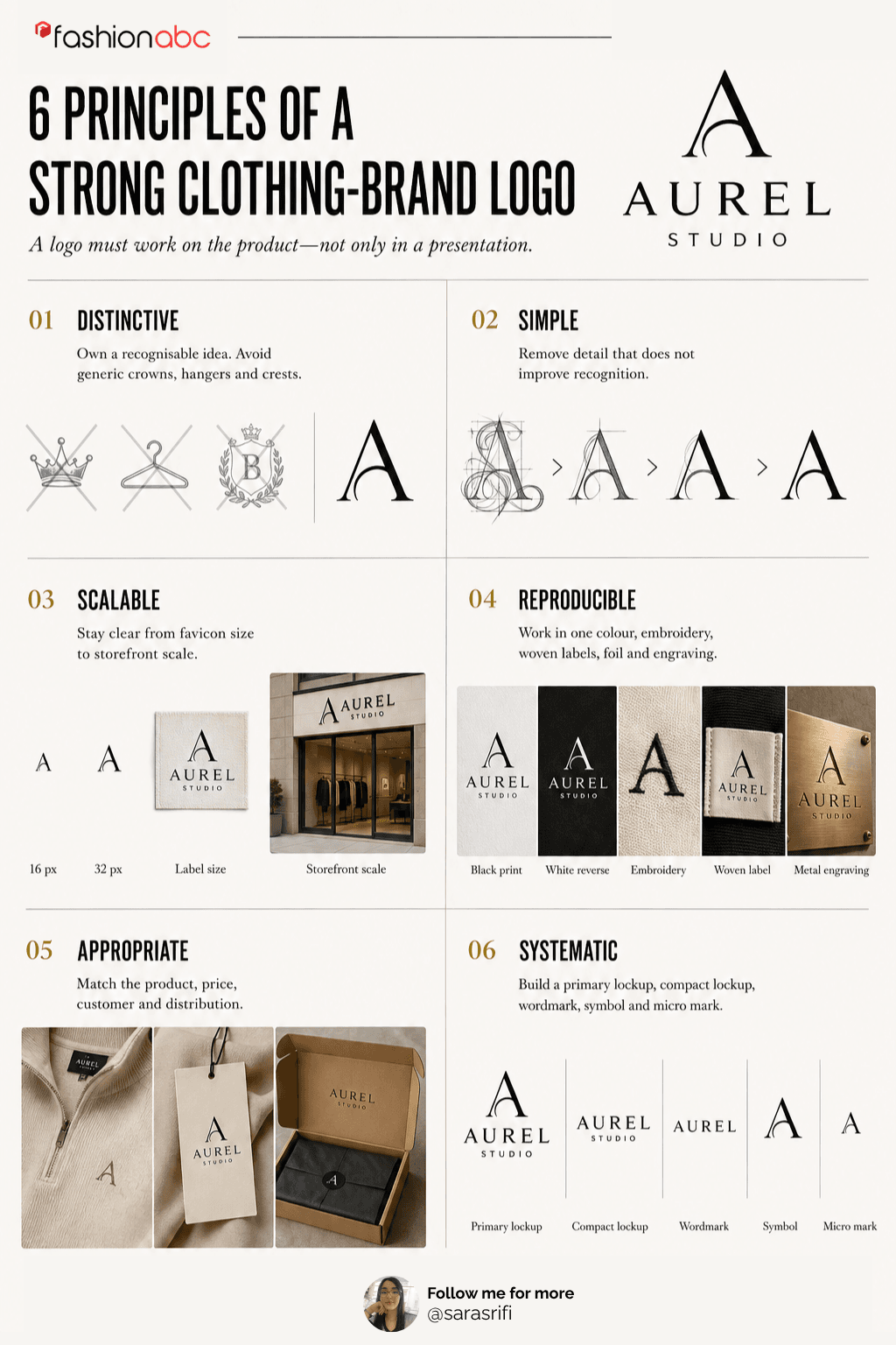
Six principles of a Strong Clothing Brand Logo – Created by Sara Srifi
1. Distinctive
Avoid default fashion shorthand unless it becomes genuinely ownable. A crown, hanger, needle, initials or generic crest may communicate the category but can disappear among competitors.
2. Simple
Remove elements that do not improve recognition. Simplicity supports memory, small-scale reproduction, embroidery and one-colour production.
3. Scalable
The mark must survive at favicon size and expand to a storefront, campaign backdrop or garment graphic without losing structure.
4. Reproducible
Test solid black, reversed white, spot colour, embroidery, woven construction, foil, engraving and low-cost printing before approving fine detail.
5. Appropriate
Match visual tone to price, category, customer and distribution. Appropriate does not mean predictable; it means strategically coherent.
6. Systematic
Create a primary lockup, compact lockup, symbol, wordmark and micro mark with rules for spacing, minimum size, colour and misuse.
Choose the right logo structure
| Logo type | How it works | Best fit | Main risk |
|---|---|---|---|
| Wordmark | Brand name drawn in distinctive lettering | New labels that need name recognition | Generic typography or poor small-size spacing |
| Lettermark | Initials or abbreviated name | Long names and compact placements | Weak recognition before the brand is known |
| Symbol | A standalone graphic device | Labels with strong visual assets | May feel anonymous without launch support |
| Combination mark | Wordmark plus symbol | Most startups needing flexibility | Too many parts if the lockup is overworked |
| Emblem | Name enclosed within a badge or crest | Heritage, workwear and community positioning | Fine detail becomes difficult to reproduce |
| Responsive system | Several approved versions for different sizes | Brands working across product and digital media | Inconsistency without strict usage rules |
The responsive clothing-logo system
| Asset | Use | Minimum test |
|---|---|---|
| Primary lockup | Website headers, lookbooks, packaging and signage | Readable at 160 px wide |
| Compact lockup | Labels, swing tags, marketplace tiles | Works in a square or narrow space |
| Wordmark | Editorial placements and name recognition | Clear in black at 25 mm wide |
| Symbol or monogram | Zips, buttons, avatars and embroidery | Recognisable at 16–24 px and 8–12 mm |
| Micro mark | Tiny woven labels and hardware | Survives one colour with no hairline detail |
| Campaign graphic | Seasonal use—not the permanent identifier | Clearly subordinate to the core identity |
PRODUCTION TEST
Print every candidate at actual size. A logo that looks refined at 300% zoom may collapse when woven, stitched or reduced to a mobile favicon.
Fashion logo examples and the lesson from each
The examples below are discussed for editorial analysis. They are not templates to imitate, and brand ownership remains with the respective trademark owners.
- Nike: A simple standalone symbol can become powerful through sustained product use and marketing. The lesson is consistency—not to create another swoosh.
- Chanel: A compact monogram can work across packaging, hardware and small applications. The lesson is geometric discipline and controlled repetition.
- Adidas: A brand can operate several related marks across product and corporate contexts. The lesson is to define roles so variants do not create confusion.
- Levi’s: Distinctive product identifiers can work alongside a wordmark, including tabs, patches and shape-based assets. The lesson is that identity can live on the product itself.
- Ralph Lauren: A detailed emblem can carry lifestyle meaning when supported by a clear wordmark and careful reproduction standards. The lesson is to plan simplified small-size versions.
- Patagonia: A wordmark and landscape device can reinforce origin and values without relying on generic outdoor icons. The lesson is to connect visual identity to an authentic brand narrative.
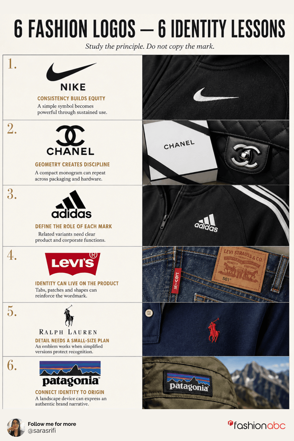
6 Fashion Logos – 6 Identity lessons – Created by Sara Srifi
Design for garments, not only screens
| Application | Design requirement | Test before approval |
|---|---|---|
| Woven neck label | Few colours, open counters and robust lines | Review a physical woven sample |
| Embroidery | Minimum stroke width and simplified detail | Run a sew-out on intended fabric |
| Screen print | Clean separations and controlled ink coverage | Test one-colour and reversed versions |
| Heat transfer | Edge integrity and fabric compatibility | Wash, stretch and abrasion test |
| Metal hardware | Solid shapes suitable for moulding or engraving | Prototype at actual millimetre size |
| Packaging | Hierarchy with legal and product information | Test cartons, tissue, stickers and shipping labels |
| Ecommerce and social | Square crop, favicon and dark/light backgrounds | Review at 16, 24, 32 and 48 pixels |
A practical clothing-logo design process
Before developing the visual identity, establish a distinctive and commercially appropriate name. Fashion founders can use this practical clothing brand naming framework
- Define the customer, product category, price position and brand promise.
- Audit direct competitors and adjacent visual categories; record repeated devices to avoid.
- Choose a logo structure: wordmark, lettermark, symbol, combination mark or emblem.
- Develop several distinct concepts in black and white before adding colour.
- Screen the proposed name and major design elements before expensive refinement.
- Build primary, compact, symbol and micro versions as one responsive system.
- Test actual garment, label, embroidery, packaging and screen applications.
- Check legibility, contrast, spacing and recognition with people outside the design team.
- Complete a broader trademark-clearance review and obtain legal advice when risk or investment warrants it.
- Issue final master files, production specifications and a short brand-usage guide.
Trademark checks before committing to a logo
In the United States, a trademark can be a word, phrase, symbol, design or combination that identifies the source of goods or services. The USPTO explains that marks need not be identical to create a likelihood of confusion: similarity in appearance, sound, meaning or overall commercial impression can matter when the goods or services are related.
A logo search should therefore cover more than the exact artwork. Search the brand name, spelling and phonetic variants, translations where relevant, initials, similar commercial impressions and prominent design elements. Review live pending applications and registrations, related goods and services, and evidence of unregistered marketplace use.
Preliminary screening checklist
- Search the word element: Use the USPTO Trademark Search system for exact wording, variants, similar sounds and related apparel or retail terms.
- Search design elements: Use USPTO design search codes for non-word components such as animals, stars, shields, plants or geometric forms.
- Review related goods and services: Clothing, footwear, headwear, retail services and accessories may be commercially related even when filing classes differ.
- Look beyond federal registrations: Search websites, marketplaces, social channels, state records, company names and relevant common-law use.
- Search internationally when needed: WIPO’s Global Brand Database supports keyword and image-similarity searching across multiple collections.
- Assess the complete commercial impression: Do not assume a changed font or colour eliminates conflict when the names, designs or market context remain similar.
- Escalate before launch: Seek qualified trademark counsel when the brand is strategically important, the search is crowded or the business will invest materially in inventory and marketing.
Word mark, logo mark or both?
| Filing approach | What it generally protects | Planning implication |
|---|---|---|
| Standard characters | The wording without claiming a particular font, style, size or colour | Can provide flexibility when the brand name is distinctive |
| Special form / design | The specific stylisation, design or colour claim shown in the application | Useful when visual treatment is central, but protection focuses on that presentation |
| Separate applications | Word and design elements pursued independently | May broaden strategy but increases filing and professional costs |
Copyright, ownership and commissioned design
Trademark and copyright answer different questions. The US Copyright Office notes that names, titles, short phrases, familiar symbols and mere variations of typography are generally not protected by copyright, although sufficiently original graphic artwork may qualify. A logo may therefore involve trademark rights, copyright rights, contract rights or a combination.
- Use a written design agreement: State the scope, payment, originality expectations, source-file delivery and assignment or licence of applicable rights.
- Record third-party assets: Identify fonts, stock elements, templates and software licences; confirm whether they permit logo and trademark use.
- Avoid unmodified templates: A widely licensed symbol is unlikely to create a distinctive, defensible identity and may be unavailable for exclusive trademark use.
- Keep development records: Retain dated sketches, briefs, approvals, licences and final files.
Files and specifications to request
- Vector masters: AI, EPS, SVG or suitable editable vector files for scaling and production.
- Raster exports: Transparent PNG and web-ready formats at defined sizes.
- Colour versions: Full colour, spot colour, black, white and approved reversed versions.
- Logo variants: Primary, compact, horizontal, stacked, symbol and micro marks.
- Colour standards: Pantone or spot references where used, plus CMYK, RGB and HEX values.
- Clear-space rules: Minimum breathing room and minimum reproduction sizes.
- Production guidance: Embroidery, woven-label, print and hardware restrictions.
- Font and licence record: Typeface names, licences and substitution rules.
- Misuse examples: No stretching, recolouring, effects, rotation, crowding or unofficial lockups.
Common clothing-logo mistakes
| Mistake | Why it fails | Better approach |
|---|---|---|
| Copying category leaders | Creates weak differentiation and potential conflict | Define the brand idea before visual references |
| Designing only at large size | Fine detail disappears on products and screens | Test actual-size micro applications early |
| Using too many effects | Gradients and shadows limit production | Approve a strong one-colour master |
| Treating the logo as the whole brand | A mark cannot replace positioning, product or voice | Build a broader identity system |
| Skipping clearance until launch | Inventory and campaigns become expensive to change | Screen early, then clear before major investment |
| Relying on a domain search | Domain availability does not establish trademark rights | Search trademarks and marketplace use |
Frequently asked questions
What type of logo is best for a clothing brand?
A combination mark is often practical for a startup because it builds name recognition while creating a symbol for labels and social profiles. The right structure depends on the name, product, position and production methods.
How much detail should a clothing logo contain?
Only as much as survives the smallest important application. If the mark must be embroidered or woven at 10 millimetres, hairline detail and tiny lettering will be unreliable.
Should a clothing logo include a hanger, needle or crown?
Only when the device is strategically distinctive. Generic category symbols can make a brand easy to understand but difficult to remember or protect.
Can I use an AI logo generator?
Use it for exploration with caution. Review originality, training and output terms, third-party similarities, font and asset licences, editability and trademark risk. Do not assume generated artwork is exclusive.
Is a trademark search enough to use a logo?
No. A preliminary search can identify obvious conflicts, but it is not clearance or a legal opinion. Similar marks, related goods, common-law use and geographic plans require judgement.
Should I trademark the name or the logo first?
Many businesses prioritise the word mark because it can protect the name independent of design, then consider a design application when the visual mark is stable. Strategy depends on distinctiveness, budget and jurisdiction.
Can a logo be protected by copyright and trademark?
Potentially. Trademark protects source-identifying use; sufficiently original artwork may also receive copyright protection. Names and basic typographic treatment generally do not receive copyright protection by themselves.
Final takeaway
The best clothing brand logos are not isolated graphics. They are flexible identity systems designed for real production: labels, garments, hardware, packaging, ecommerce and campaigns. Begin with positioning, develop distinct concepts in one colour, test them at actual size and approve responsive variants with clear usage rules.
Screen both the name and the design before investing heavily, then obtain professional advice when the brand’s value or risk justifies it. Return to Fashionabc’s How to Start a Clothing Brand to connect the identity work with business planning, product development, manufacturing and launch.
Sources
- USPTO — What Is a Trademark?
- USPTO — Strong Trademarks
- USPTO — Search the Trademark Database
- USPTO — Comprehensive Clearance Search
- USPTO — Likelihood of Confusion
- USPTO — Design Search Codes
- USPTO — Trademark Examples and Filing Formats
- WIPO — Global Brand Database
- US Copyright Office — What Copyright Protects
- US Copyright Office — Works Not Protected by Copyright
Share

Sara Srifi
Sara is a Software Engineering and Business student with a passion for astronomy, cultural studies, and human-centered storytelling. She explores the quiet intersections between science, identity, and imagination, reflecting on how space, art, and society shape the way we understand ourselves and the world around us. Her writing draws on curiosity and lived experience to bridge disciplines and spark dialogue across cultures.


