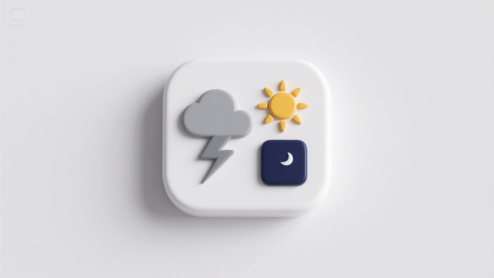
When the sky changes, why shouldn’t your creativity? Imagine a café’s feed showing iced lattes under noon glare and steaming mugs the minute rain hits. Picture a sneaker shop’s window looping neon ripples when thunderstorms roll through town. With an AI photo generator and a little weather logic, your brand can swap imagery on the fly. In this tour, we’ll sketch how it works—and we’ll bring Dreamina AI image generator along for the building.
The Self-Updating Storefront AI Visuals That Change With the Weather
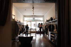
Windows that talk back to the sky
Weather-reactive visuals feel alive because they mirror what customers experience right now. The trick is tying mood to meteorology without losing brand coherence.
- Sun exposure: It means high contrast and crisp shadows; rain leans into reflections and soft glows; fog favors minimal shapes and big type.
- Temperature guides palette: warm hues for heatwaves, icy gradients for cold snaps.
- Wind suggests motion: ribbons, particle trails, or typography that “leans” into the breeze.
These cues turn a static feed into a conversation with the weather app in your audience’s pocket.
Forecast-to-fork: restaurants that season their visuals
Menus already shift with the seasons; visuals can too—hourly, even.
- Heatwave specials: show frosted glasses, condensation, and citrus slices; widen negative space so the creative “breathes.”
- Rainy-day comfort: push closer crops of textures—bubbling sauces, flaky crusts, steam lines—so the screen feels warm.
- Cold mornings: pair thick sans-serif headlines with knit-like textures to echo cozy layers.
Each swap is subtle, but together they nudge decisions: “This feels right now.”
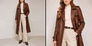
Retail that reharmonizes in real time
For fashion and lifestyle, weather is wardrobe. Use it to cue product rotations and stories.
- Sunny: saturated lookbooks, high-speed shadows, lively diagonals.
- Overcast: desaturated, matte, editorial calm—perfect for premium drops.
- Snow: sparkle grains, slower transitions, and symmetrical compositions to imply quiet.
The goal: keep the grid fresh while the brand stays unmistakable.
The choreography of consistency
Responsive visuals shouldn’t scramble identity. Define a “weather kit” the brand cycles through.
- Core constants: logotype placement, type pairing, and a 2–3 color anchor that never changes.
- Variable accents: background textures, motion tempo, and framing.
- Fallbacks: when weather data fails, default to a neutral “evergreen” set.
If you’re refreshing a mark for different conditions, prototype families of lockups. This is a smart moment to bring in Dreamina’s AI logo generator to explore subtle alternates—storm, sun, night—while preserving geometry and recognizability.
When prints behave like screens
Street posters and window clings can still “update”—just not literally. Design modular sets that simulate change across the city.
- A trilogy poster series: one sunny, one rainy, one nocturnal. Rotate installs based on the forecast.
- Die-cut overlays that add droplets or starry speckles when swapped.
- Reflective inks that explode under headlights at night.
You’ll create the impression of a living system even with physical media.
Tiny storms: character stickers that travel
Weather can become a lovable character your audience collects. A smiling sun with sunglasses, a broody cloud in boots, a caffeinated raindrop—each tied to offers or playlists.
Roll them into limited drops and let your community place them on cases and bottles. That’s where Dreamina’s sticker maker shines: fast runs, variant packs, and QR codes that trigger the day’s weather filter when scanned.
Data, drama, and decency
A few guardrails keep the magic joyful:
- Context: avoid imagery that contradicts real conditions; nothing breaks trust like a beach scene during a blizzard.
- Accessibility: color contrast must remain readable across palettes.
- Respect: keep geolocation use transparent; you don’t need precise targeting to trigger a city-wide weather theme.
The live-ops mindset for design
Treat your visuals like a game that updates. Build a small calendar of “weather moments” (first heat spike, first snow, seasonal storms) and pre-design the assets. When the moment hits, your system merely flips a switch. Dreamina helps you sketch and generate those alternates quickly—and stylistically match them—so the brand stays tight while the weather wanders.
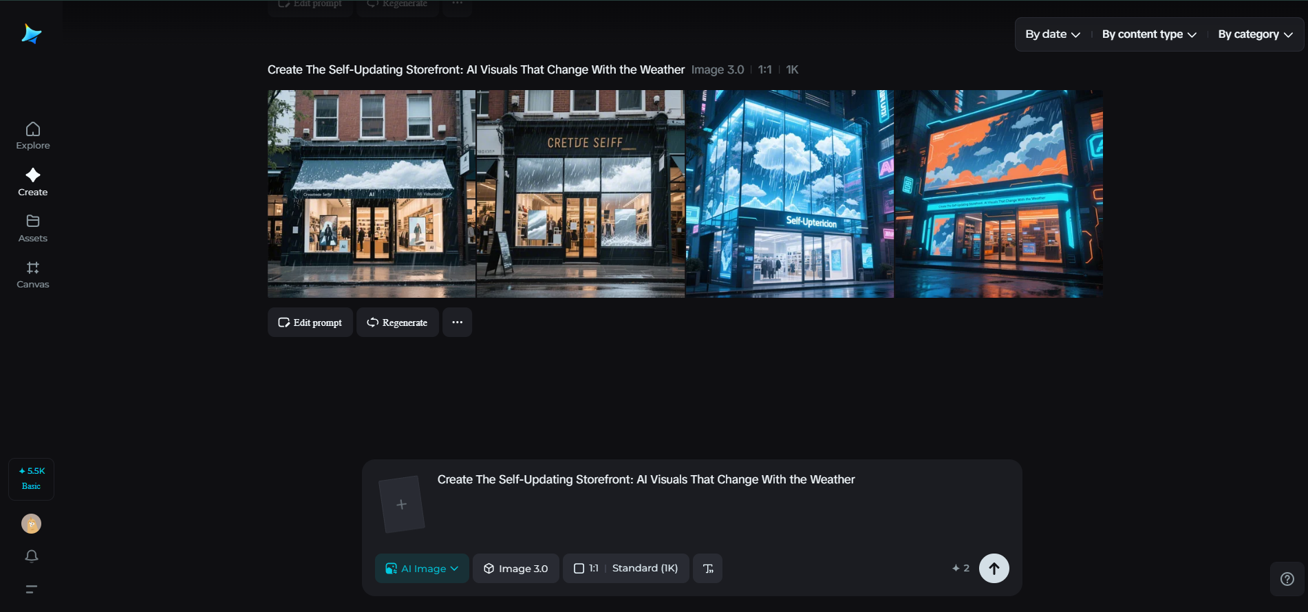
Forecast to feed: craft a weather-reactive visual with Dreamina
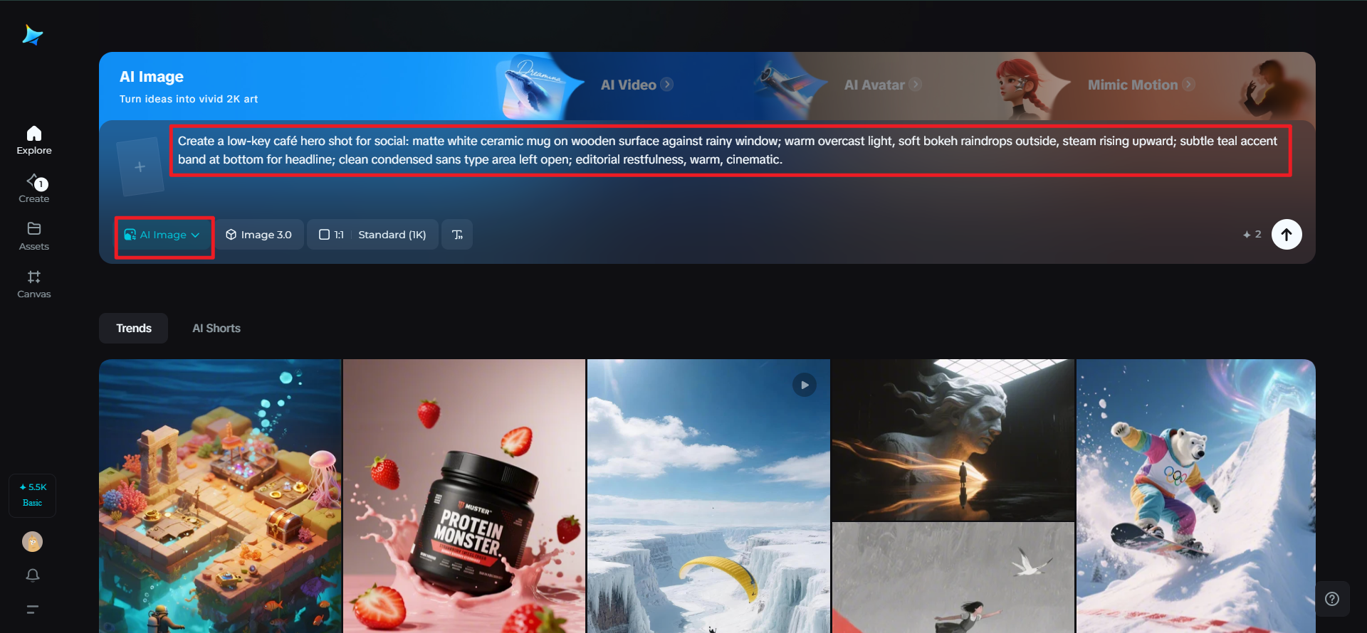
Step 1: Compose a monorail text prompt
Go to Dreamina and set both your mood and the weather of the day in one sweep. Incorporate color, texture, light, and position.
For instance: Low-key café hero shot for social: matte white ceramic mug on wooden surface against rainy window; warm overcast light, soft bokeh raindrops outside, steam rising upward; subtle teal accent band at bottom for headline; clean condensed sans type area left open; editorial restfulness, warm, cinematic.
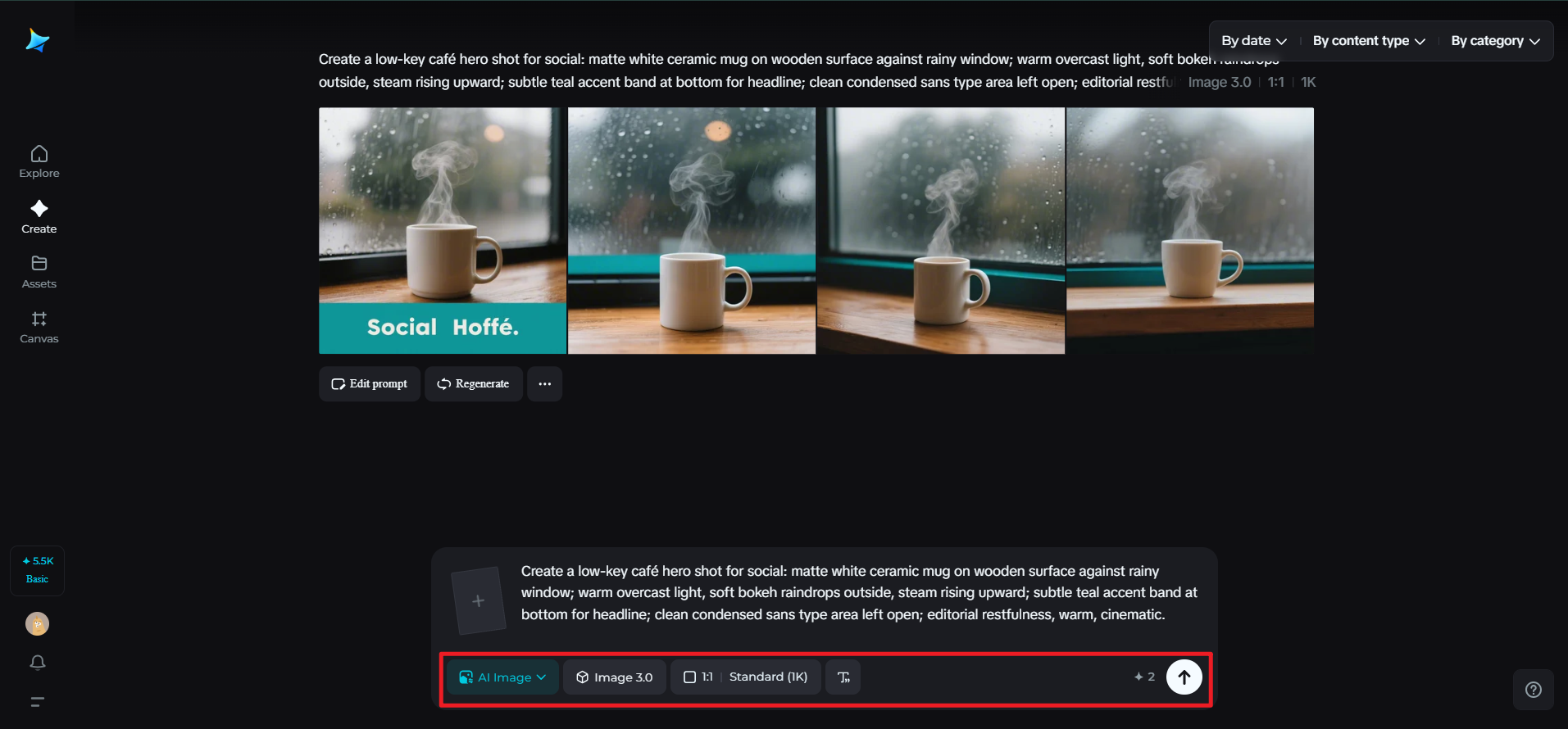
Step 2: Modify parameters and create
Select your model, create an aspect ratio for tales or posts, choose size, and choose resolution (1k or 2k). Tap Dreamina’s icon to create. If your brand comes in many formats, do the same with square and vertical versions so the rainy atmosphere remains consistent.
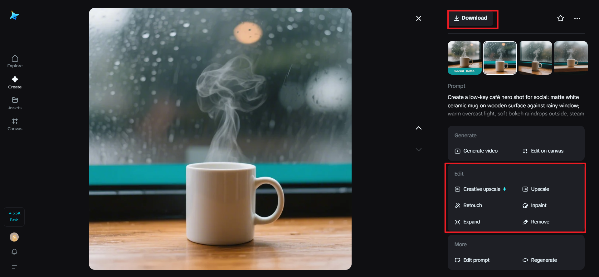
Step 3: Personalize and download
Utilize Dreamina’s AI adjustment features—inpaint, expand, remove, and retouch—to adjust droplets, add steam curl, or lengthen background for text. Once it feels brand-fit, press the Download icon to deliver your final asset.
Scenes that swap themselves: a few nimble campaign recipes
The noon flip
Two versions of a product shot—cool morning palette and warm afternoon palette. At midday, your site and socials switch automatically. Audiences feel the rhythm without a word.
The storm watch offer
When precipitation probability passes a threshold, your format adds animated ripples or reflective typography and unlocks a “Rain Room” discount code. Take care that motion stays subtle for readability.
The night bloom
After sunset, colorways deepen, gradients gain velvety black, and specular highlights become stars. The same poster now reads like a limited-edition drop.
Visual ingredients that forecast well
Keep a shelf of reusable parts that adapt beautifully:
- Light rigs: rim light for sunny days; softboxes for cloudy; underglow for evenings.
- Texture fields: grain for fog, prism flares for sun, micro-droplet overlays for rain.
- Framing: looser crops in heat (airiness), tighter crops in cold (coziness).
Think of these as weather macros you can apply to new product shots in seconds.
Measuring the breeze without losing the soul
Yes, you’ll peek at metrics, but let taste lead. A practical loop:
- Watch tap-through and dwell time when conditions change; a gentle uptick signals resonance.
- Ask your community which weather set they want next weekend; turn it into a playful poll.
- Retire effects that feel gimmicky after two runs; keep the ones fans nickname.
The outcome isn’t just higher engagement; it’s a brand that feels present, even empathetic—like a barista who remembers your order and notices the storm.
Closing the umbrella
Weather-reactive branding is less about fancy tech than attentive design. By choosing a small palette of mood shifts, building modular assets, and treating visual ops like a living system, your storefront starts to breathe with the day. Dreamina helps you spin up these alternates fast, align them to your identity, and keep the experience artful—not automated. Tomorrow’s sky will be different. Good thing your creativity is, too.