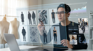
Lean design teams face a painful choice. Do you pay thousands for custom art, or settle for generic stock that screams “template”?
For years, the answer was binary. You either bought soul or saved money. Ouch, a project by the Icons8 team, targets the middle ground. It isn’t just an image repository. It is a collection of distinct aesthetic systems built for the entire UX flow.
UI designers and developers don’t need pretty pictures. They need scalable vectors, 3D objects, and animations that actually fit together. Here is how this library functions in a production environment.
Building a Visual System Without an In-House Illustrator: A Look at Ouch
The Architecture of Consistency
Inconsistency kills most stock sites. You find the perfect hero image, but the “Contact Us” icon looks like it came from a different planet.
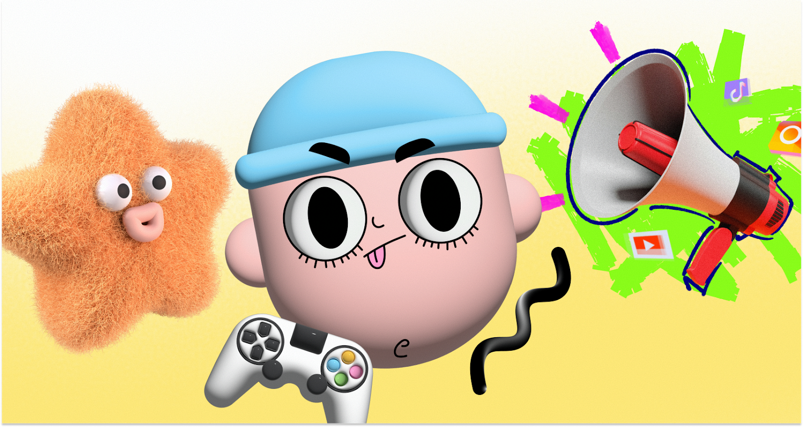
Ouch solves this with “Styles.” The library currently hosts over 101 distinct looks, spanning 3D renders, flat vectors, and surrealist sketches. That covers 28,000 business illustrations and 23,000 tech assets.
Pick a style-say, “Business 3D”-and stick to it. You will find assets for the entire user journey, including the boring bits: 404 pages, empty states, and error messages.
Scenario: Constructing a SaaS Onboarding Flow
Imagine a product designer building a B2B SaaS platform. The goal: a welcoming onboarding experience without drawing from scratch.
Since the brand is technical, they skip the hand-drawn look for a minimal geometric style. Three screens are needed: “Welcome,” “Import Data,” and “Success.”
- Selection: Search concepts like “data” or “celebration” within the chosen style. Ouch categorizes by tags and objects, not just pre-made scenes. A specific vector of a server rack appears alongside a character holding a chart.
- Modification: Download the SVG (paid plan required). Open it in Figma. Delete background elements to reduce noise.
- Branding: Default blues rarely work. Select all paths with that fill color. Swap them to the company’s primary purple hex code.
- Implementation: Export optimized SVGs. Hand them to development. The “Import Data” screen now feels like a direct continuation of the “Welcome” page, not a jarring jump to a new artist.
Scenario: Rolling Out a Marketing Campaign
A marketing manager needs to launch a social campaign and landing page for a new mobile feature. Speed beats granular control here.
2D vectors feel too “techy” for a consumer app, so they filter for 3D. Ouch offers about 44 variations. They pick a “clay” aesthetic for a tactile, friendly vibe.
- Asset Gathering: Grab high-res PNGs for social posts. The landing page hero needs more than a static image. It needs movement.
- Animation: Check the formats. Ouch supplies Lottie JSON, Rive, and After Effects files. Download a pre-animated Lottie file of a 3D character using a phone.
- Deployment: Pass the Lottie file to the web dev. It keeps the page load light. For Instagram stories, use the MOV version of the same asset.
A Day in the Workflow: The Indie Developer
Meet Jonas, a full-stack dev building a finance tracker. He can’t draw, and he won’t hire a freelancer.
At 9:00 AM, he opens the Pichon desktop app (an Ouch integration) and floats it over his code editor. He needs a “Budget Exceeded” icon. Standard warning triangles are boring. He wants emotional weight. A search for expressive characters reveals an angry clipart style. It conveys frustration without aggression. He drags the vector straight into his VS Code folder.
By 2:00 PM, the landing page features section needs work. He wants a complex scene showing “Investment Growth.” Using the integrated Mega Creator tool, he grabs a character from one scene and a graph from another. He rearranges them to fit the layout. They blend perfectly because they share the same style pack.
At 5:00 PM, the “Savings” illustration clashes with dark mode. Jonas uses the on-site recoloring tool to shift the palette to lighter pastels, downloads the PNG, and commits the code.
Limitations and When This Tool Is Not the Best Choice
Ouch handles consistency better than general stock sites, but it has boundaries.
- Ubiquity: Popular styles are popular for a reason. You might see a competitor using your exact “3D Business” characters. If total visual uniqueness defines your brand strategy, skip stock entirely.
- Niche Metaphors: The library is vast, covering Business, Healthcare, and Education. But specific technical metaphors might be missing. Need an illustration of “Kubernetes pod orchestration failing due to latency”? You’ll have to compose it yourself or hire an artist.
- Attribution: Free tiers are generous but require a link back to Icons8. Professional projects usually can’t clutter footers with attribution links, making the paid upgrade mandatory.
Comparison with Alternatives
Ouch vs. Undraw:
Undraw is the open-source darling of tech. It’s free and color-customizable. But it’s everywhere. Using it instantly signals “bootstrapped project.” Ouch offers 101+ styles versus Undraw’s single flat look, enabling better differentiation.
Ouch vs. Humaaans/Blush:
Blush focuses on mix-and-match character composition. It’s great for diversity. Ouch goes broader. It includes inanimate objects, 3D abstract shapes, and web elements, not just people standing around.
Ouch vs. Custom Illustration:
Custom work offers soul no library can match. But it’s slow and expensive. Ouch is the 80/20 solution: 80% of the quality for a fraction of the cost.
Practical Tips for Realistic Usage
Get the most out of Ouch without looking like a template user. Follow these practices:
- Commit to One Style ID: Don’t mix 3D fluff with flat lines. Pick one pack. Pretend it’s the only one that exists.
- Recolor Ruthlessly: Default colors are a giveaway. Shift the hue even slightly to match your brand palette. It makes the asset look proprietary.
- Use 3D Models (FBX): Got 3D skills? Download the FBX files. Re-light and rotate models in your own software to get angles unavailable in the standard PNG set.
- Deploy Lottie: Static images bore users. Pre-made Lottie and Rive animations add micro-interactions without the need for a motion designer.
Ouch bridges the gap for teams outgrowing generic clipart but not ready for a full-time illustrator. Treat the library as a component system, not a picture gallery. You’ll build a visual language that feels intentional.